Squarespace 7.1 — How to make a map block full width and higher in mobile.
In this post, I show you how to make a full width map block in Squarespace and how to increase the default height in the mobile view, including the CSS to accomplish this Squarespace 7.1.
Squarespace 7.1 — Map Block to Full Width
I was building a client’s website in Squarespace 7.1 (in September 2022) and they requested a map block as the header image. However, if you add the map block and even if you set the “content width” to L for Large, or to 100 (for 100%) it still does not go from side to side, in a full width (edge-to-edge) which is what they wanted. It requires some additional CSS to achieve this. It’s not actually hard, so follow along and you will be finished in just a few mins.
Set the Block to Large
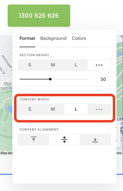
Simply edit the Map Block Section and in the Format tab, select “L” for Large in the Content Width area. Then save that page change.
Add some CSS for True Edge-to-Edge
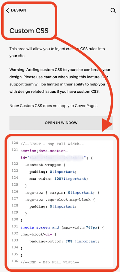
Now navigate to the area “Design” and then “Custom CSS” so we can add custom CSS to tell the map block to expend to a true edge-to-edge. Now copy and past the code below, however make sure you replace the “XXXXXXXXXXXXXXXXXXXXXX” shown below, for your actual Section ID number of your map block.
//--START - Map Full Width and Mobile Extra Height--
section[data-section-id="XXXXXXXXXXXXXXXXXXXXXX"] {
.content-wrapper {
padding: 0!important;
max-width: 100%!important;
}
.sqs-row { margin: 0!important; }
.sqs-row .sqs-block.map-block {
padding: 0!important;
}
}
//--END - Map Full Width and Mobile Extra Height--
Additional CSS to Increase the Mobile Height of the Map Block
This is where many of the other posts online stop and of course it doesn’t give you the desired effect of the increased height in the mobile view. We need to add some additional CSS code to achieve this.
So we need to also paste this code to tell mobile browsers what to do:
@media screen and (max-width:767px) {
And this line to tell it to apply to the Map Block:
.map-block>div {
And this line of code to tell it how high we want the map to be. I settled on 70% but you can adjust this up or down to your desire.
padding-bottom: 70% !important;
So your full CSS code should look like this (though with your actual Section ID replacing the “XXXXXXXXXXXXXX” as we covered above.
//--START - Map Full Width and Mobile Extra Height--
section[data-section-id="XXXXXXXXXXXXXXXXXXXXXX"] {
.content-wrapper {
padding: 0!important;
max-width: 100%!important;
}
.sqs-row { margin: 0!important; }
.sqs-row .sqs-block.map-block {
padding: 0!important;
}
}
@media screen and (max-width:767px) {
.map-block>div {
padding-bottom: 70% !important;
}
}
//--END - Map Full Width and Mobile Extra Height--
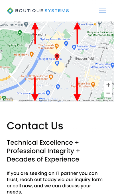
The Final Result — A Map Block at Full Width and Higher in Mobile View.
Looking for a New Website?
Great web design grabs your attention and gives you what you need without effort. THREE CATS small business web design packages with SEO, are strategically designed to drive more traffic to your website, converting visitors to customers.
Professional, Strategic, Australian Web Design!


